Week 14: Business Cards 1
TASK 1 RESEARCH AND WRITING
Create a blog post on your portfolio blog. Collect no fewer than 20 business cards from various sources on the internet. Beneath each image, add a caption that critiques the following:
*Note - the term cardholder is used to represent the person for whom the business card was made.
1.) Legibility/Clarity - How clear is the text to read, and how easy is it to determine the sort of business the cardholder performs? Provide evidence by citing details.
2.) Context - Does the overall use of color, imagery, font style in the design fit the expected work performed by the cardholder?
3.) Design Appeal - Does the design of the business card exhibit Balance, portray Contrast, show Emphasis, and generally hold your attention?
 1.) Legibility/Clarity:the text is really easy to read its in a gold writing and its kinda bold
2.) Context - the overall color use really good because the gold pops out the black
3.) Design Appeal -the design of the business card has contrast because its gold outline of the writing with a black back ground.
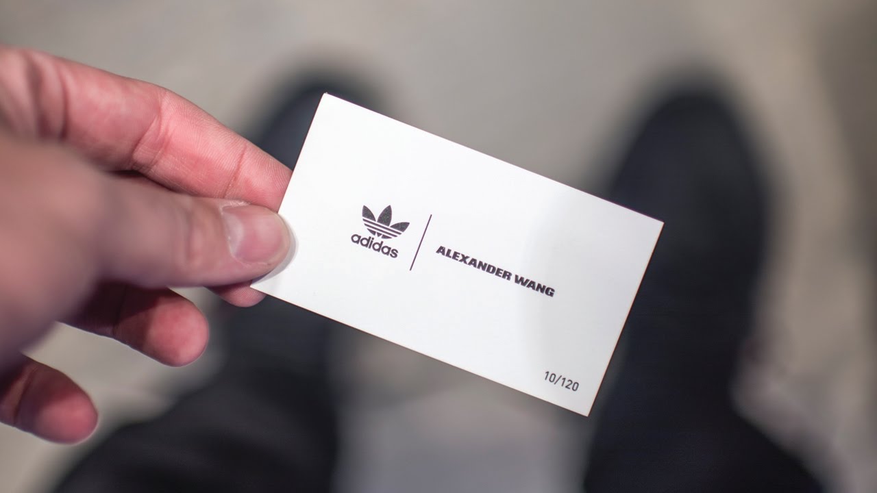
 1.) Legibility/Clarity:the text is basic it just has the logo and the name no other info
2.) Context -the color does pop out but not to much because its just the back ground white and the letters black and the design in black
3.) Design Appeal:the design is just the logo and the name who's representing the company
2.) Context - there's a lot of color going on in this card red with white hand writing and the mc donalds logo and its half eatten
3.) Design Appeal: the design its like someone bit into a burger
 1.) Legibility/Clarity: The logo is a nike symbol with the information on the left side and in the back ground theres a nike symbol faded out
2.) Context - there isn't so much color in the front of the card but once you hit the back there's color green with red and some details on top
3.) Design Appeal: the design is really nice
Context-


Comments
Post a Comment